
Color is a powerful force that impacts us in ways we often don’t fully realize. Whether it’s the clothes we wear, the marketing we interact with, or the interior design of a space, the psychology of color plays a crucial role in influencing emotions, behaviors, and creativity. Understanding how different colors affect our moods and thinking processes can help individuals make better choices in their personal and professional lives.
Understanding Color Psychology
Color psychology is the study of how different hues and shades can evoke specific emotions, thoughts, and responses. It’s a concept widely used in various industries, including marketing, art, design, and even psychology. Colors have the ability to impact our mood, behavior, and even our decision-making abilities.
Colors often carry cultural meanings and personal associations, but research has shown that certain colors generally produce similar reactions across diverse cultures. Let’s take a closer look at how specific colors affect us.
1. The Emotional Impact of Colors
- Red – Red is a color that demands attention. It’s associated with passion, excitement, and urgency. In nature, red often signals danger or warning, which is why it’s a color that can raise heart rates and make us feel alert. In marketing, red is often used to evoke strong emotions, driving action like making a purchase or drawing attention to a product. In terms of creativity, red can stimulate energy and determination.
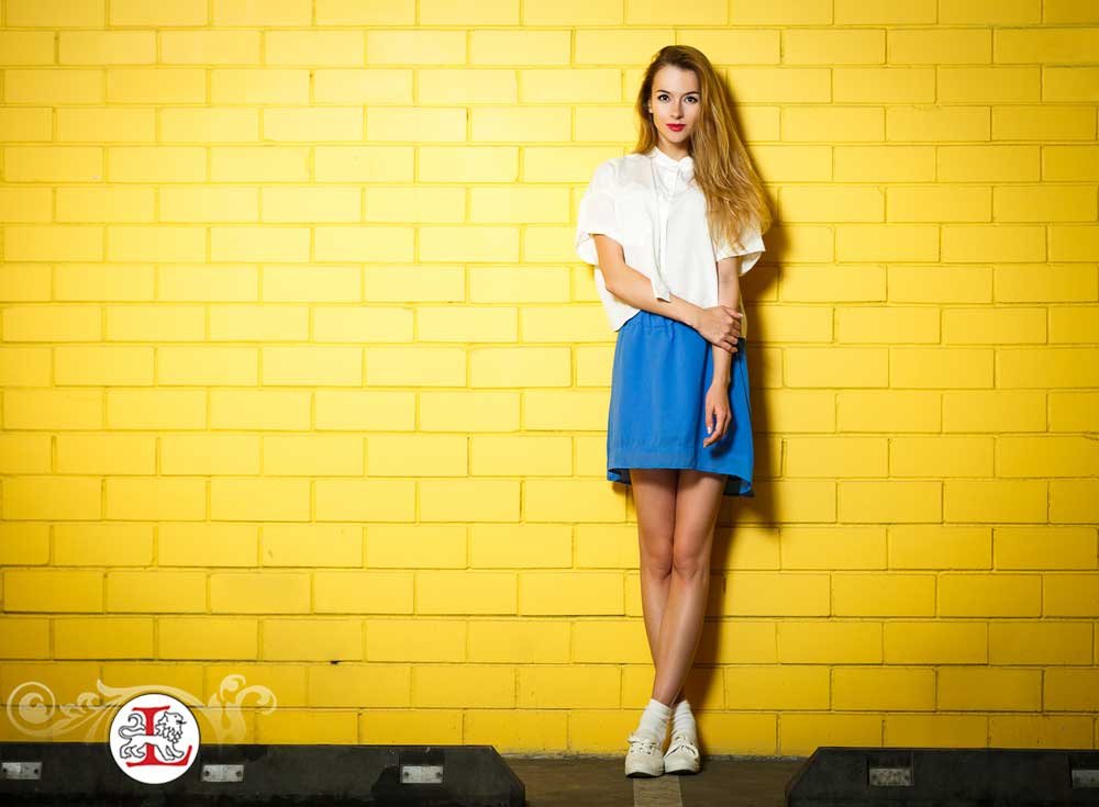
- Blue – Blue is universally known for its calming and soothing effects. It’s often associated with tranquility, reliability, and trust. In business, blue is a popular choice for branding, as it instills a sense of professionalism and dependability. For creative individuals, blue can foster focus and clear thinking, which is why many workspaces incorporate this color.
- Yellow – Yellow is the color of optimism, happiness, and creativity. It’s a stimulating color that evokes positive emotions, such as joy and energy. However, too much yellow can lead to feelings of anxiety or frustration. The key to using yellow effectively is balance, as it can spark creativity and innovation while maintaining a sense of cheerfulness.
- Green – Green is the color of nature, symbolizing growth, balance, and renewal. It has a calming effect on the mind and body and is often associated with health and well-being. For creative projects, green can foster a sense of balance, making it easier to generate new ideas while remaining grounded.
- Purple – Purple combines the calm stability of blue and the energy of red, making it a color that represents creativity, luxury, and mystery. Purple is often used in artistic contexts to evoke a sense of originality and deep thought. It’s also a color that represents spirituality, as well as a regal sense of power.
2. The Link Between Colors and Creativity
Creativity thrives in environments that promote focus and inspiration. The colors around us can either enhance or hinder our creative processes, depending on how they are used. Here’s how specific colors influence creative thinking:
- Blue – As mentioned, blue is known to stimulate clear thinking and concentration. It’s commonly used in offices, study rooms, and creative workspaces where focus is needed. Studies have shown that blue can help increase productivity, making it an ideal color for environments that require mental clarity.
- Yellow – Yellow has been found to inspire creativity and innovation, especially in group settings. This color encourages individuals to think outside the box and engage in brainstorming sessions. Yellow’s energetic and optimistic nature provides an uplifting environment that sparks new ideas and encourages spontaneous thinking.
- Green – Green is ideal for fostering balance and renewal in the creative process. It is often used in spaces where relaxation and mental clarity are important. Many creative individuals, such as writers and artists, find green to be a calming influence that allows them to think deeply and produce innovative work.
3. Color in Design and Art
In the world of design and art, color is one of the most important elements. Artists use color to convey emotion, create visual harmony, and guide the viewer’s eye. In marketing and branding, companies carefully select colors that align with their message, target audience, and emotional appeal.
- Color Schemes – Successful design often incorporates color schemes, which are combinations of colors that complement or contrast with one another. The right color scheme can help evoke a specific mood or highlight key elements in a design. For example, monochromatic color schemes use varying shades of one color to create a cohesive look, while complementary color schemes use opposite colors on the color wheel to create contrast and visual interest.
- Color in Branding – Companies often rely on color to shape their brand identity. Think about iconic brands like Coca-Cola (red), Facebook (blue), and Starbucks (green). These companies have chosen colors that reflect their values, mission, and target demographics.
4. The Impact of Color on Decision-Making
Colors also play a significant role in the decision-making process, especially in areas like advertising and marketing. For example, research has shown that certain colors can influence purchasing decisions. Red and yellow, which are energetic and attention-grabbing, are often used in sale advertisements to increase urgency. Conversely, colors like blue and green are used to build trust and encourage a calm, methodical decision-making process.
5. How to Use Colors in Your Environment
Understanding color psychology can help you make smarter choices when designing your living spaces, workspaces, or even your wardrobe. Here are a few tips on how to use colors in your environment to enhance creativity and well-being:
- In the Office – For a workspace that fosters productivity, consider using blue, which promotes focus and mental clarity. If you need a boost of creativity, add pops of yellow to encourage innovation.
- In the Home – Green is an excellent choice for bedrooms and living rooms, as it promotes relaxation and balance. For a more luxurious atmosphere, consider adding touches of purple or gold.
- In Fashion – Choose colors that align with your mood or the message you want to convey. Red is a powerful choice for confidence and energy, while blue is ideal for a calm, professional look.
By understanding how colors affect emotions and creativity, you can design spaces and select items that resonate with your personal goals and creative needs.